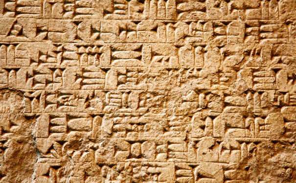
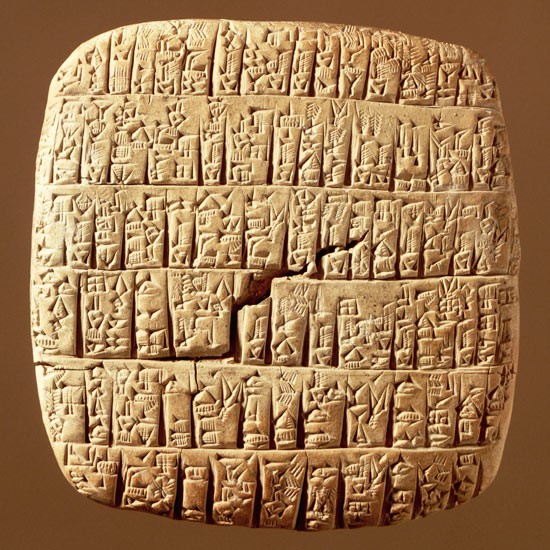
Because writing was born a long time ago SUMERIAN CUNEIFORM
The inspiration of the style was taken from the Sumerian cuneiform which is known to be the earliest writing system. Its origins can be traced back to about 3,200 BC and it developed from the pictographs and other symbols used to represent trade goods and livestock on clay tablets.
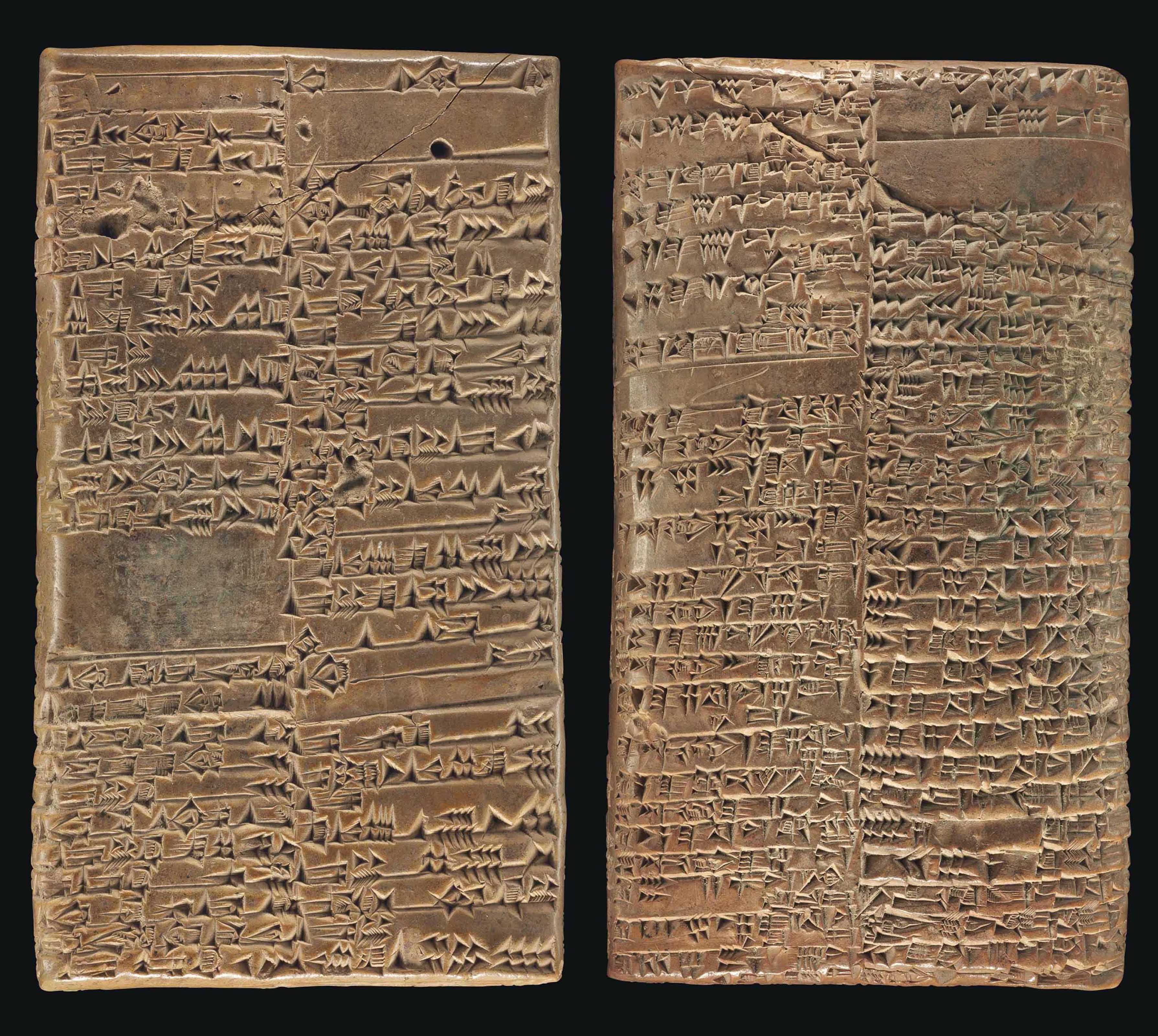
The word cuneiform derives from Latin ‘cuneus’, meaning ‘wedge-shaped’. It refers to the shape made each time while engraving cuneiform symbols with a reed stylus into the clay. In order to convey the idea of Sumerian tokens engraved on the clay texture, we made use of CSS property text-shadow: as well as white contrasting colour to make letters more integral and real.
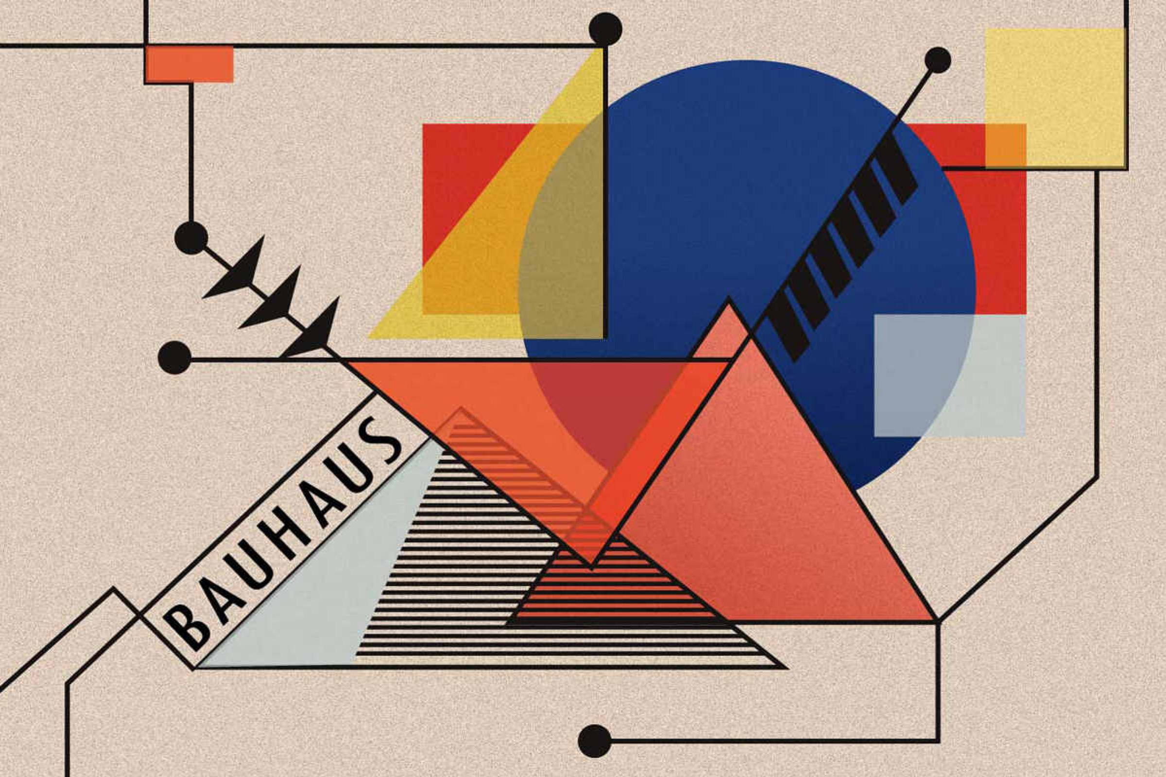
Fonts
While manipulating fonts we opted for Kakoulookiam font for headings since the font includes every known glyph for the ancient inscription. Assuming that only a few people can read and understand sumerian script we used the :hover selector to display heading with a readable font when users mouse over them.
For the <p> articles content part we operated a smoother Cuneiform font which tries to emulate ancient script with familiar characters, making them pointed and edgy.
Peskyphoenicians font was used for image captions to create the feeling of extra ancient mystery and make users get a better idea of sumerian style text representation at the visual level. For instance, some letters have the inclination or token symbols similar to that used by the sumerians.
By using column CSS properties we specified the style of the rule between columns to create that “lined” texture inherent to clay tablets.
Bibliography
- Wikipedia page about Sumerian cuneiform;
- Cuneiform Library at Cornell University - The website has been developed by the Department of Near Eastern Studies, the Cornell University Library, and the Cuneiform Digital Library Initiative at UCLA with the aim to create an online corpus of the cuneiform tablets;
- Tablets Relating to Sumerian History in the Schøyen Collection -A website developed in cooperation with the National Library of Norway. It contains translations, commentary, and pictures of Sumerian cuneiform tablets of various contents kept in the Schøyen Collection, which is located in Oslo and London.
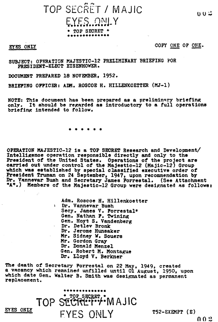 Monospaced typefaces were born from the limitations of mechanical typewriters. When the typist pressed a key, the carriage moved the paper the same distance each time, so it was easier to return to a previous printing point to make corrections and do tabulation work.
For what concerns the font family, we opted for Special Elite, since it was expressly created to mimic the Smith Corona Special Elite Type No NR6 and
Monospaced typefaces were born from the limitations of mechanical typewriters. When the typist pressed a key, the carriage moved the paper the same distance each time, so it was easier to return to a previous printing point to make corrections and do tabulation work.
For what concerns the font family, we opted for Special Elite, since it was expressly created to mimic the Smith Corona Special Elite Type No NR6 and  Furthermore, typewriters were not originally justification-capable machines, mainly because the space between words was fixed. Since the first device which allowed the automatic justification of text was patented most likely in 1920, we decided to keep this layout
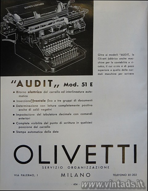 feature, that fits better the style of the typewriter of the late nineteenth century. In our stylesheet, the spacing between words has been set at 6px.
Some examples of this typographic design can be found in
feature, that fits better the style of the typewriter of the late nineteenth century. In our stylesheet, the spacing between words has been set at 6px.
Some examples of this typographic design can be found in  The background image of the article is a black
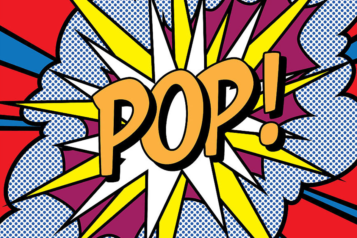 in December 1962; the occasion was a "Symposium on Pop Art"
organized by the Museum of Modern Art.
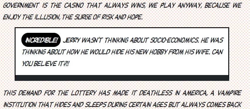
The movement presented a challenge to traditions of fine art by including imagery from popular and mass culture, such as advertising, comic books and mundane cultural objects. Product labeling and logos figure prominently in the imagery chosen by pop artists, seen in the labels of Campbell's Soup Cans, by Andy Warhol. One of its aims is to use images of popular (as opposed to elitist) culture in art, emphasizing the banal or kitschy elements of any culture, most often through the use of irony.
It is also associated with the artists' use of mechanical means of reproduction or rendering techniques.
in December 1962; the occasion was a "Symposium on Pop Art"
organized by the Museum of Modern Art.
The movement presented a challenge to traditions of fine art by including imagery from popular and mass culture, such as advertising, comic books and mundane cultural objects. Product labeling and logos figure prominently in the imagery chosen by pop artists, seen in the labels of Campbell's Soup Cans, by Andy Warhol. One of its aims is to use images of popular (as opposed to elitist) culture in art, emphasizing the banal or kitschy elements of any culture, most often through the use of irony.
It is also associated with the artists' use of mechanical means of reproduction or rendering techniques.
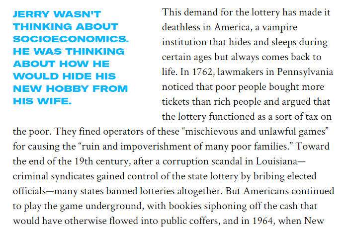
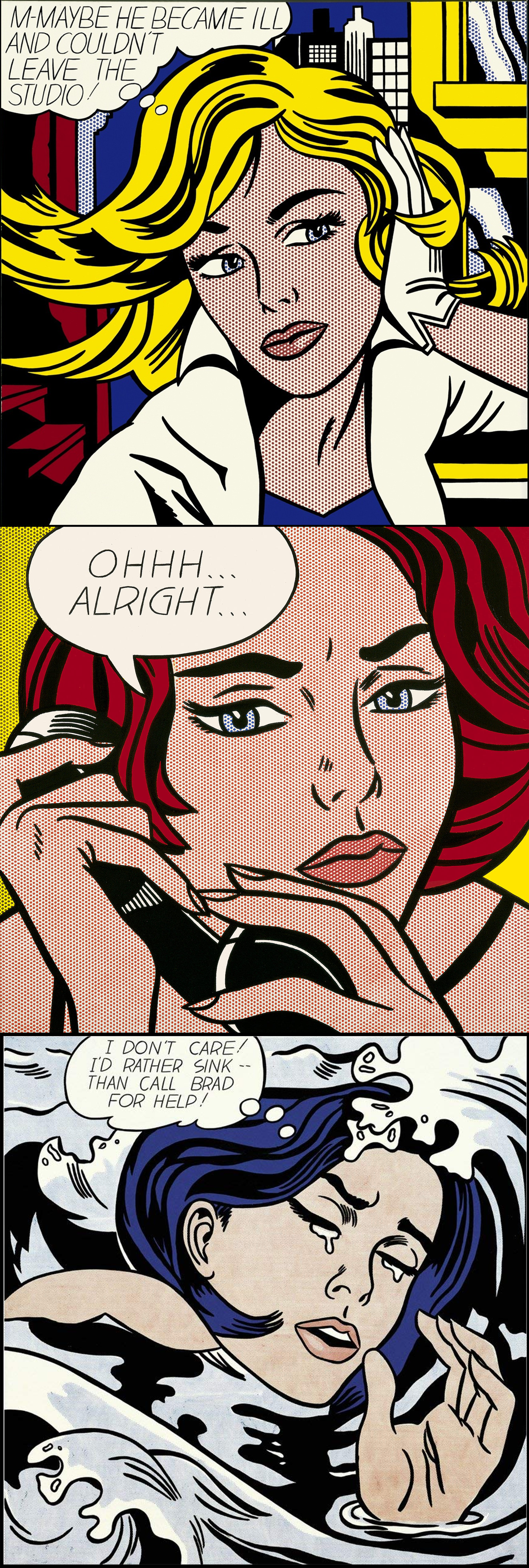 bombarded every day with the diversity of mass-produced imagery, Lichtenstein's work features thick outlines, bold colors and Ben-Day dots ("My style just don't come out looking calligraphic, like Pollock's or Kline's.").
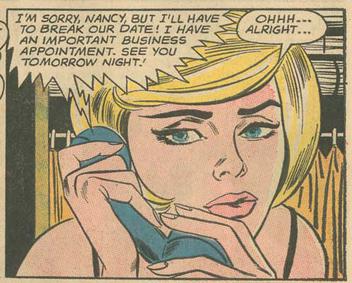 Each of them was appropriated from stories in DC Comics' Secret Hearts, like 'Ohhh...Alright...', taken from #83.
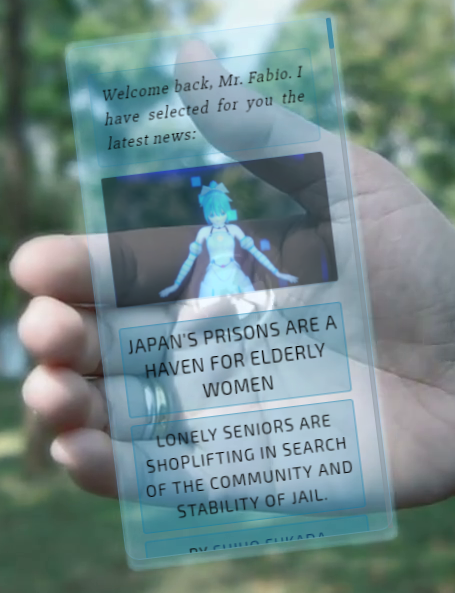 For this reason, we decided to display a real-size possible "holographic mobile phone" held in the hand of a person, with a compact and futuristic design. In the background we put a blurred photograph of a natural area (a park, a garden...) to point out
our optimistic vision of the future, accompanying it with sound of birds chirping. The choices of shades of light blue had been made to give a overall feeling of a modern flow, enhanced also by the "breathing" of the holographic device in the hand of the portrayed user, to simulate his/hers own breathing that is passed to it from the body, through the arm and eventually through the hand.
For this reason, we decided to display a real-size possible "holographic mobile phone" held in the hand of a person, with a compact and futuristic design. In the background we put a blurred photograph of a natural area (a park, a garden...) to point out
our optimistic vision of the future, accompanying it with sound of birds chirping. The choices of shades of light blue had been made to give a overall feeling of a modern flow, enhanced also by the "breathing" of the holographic device in the hand of the portrayed user, to simulate his/hers own breathing that is passed to it from the body, through the arm and eventually through the hand.
 is Fabio Vitali, the message, therefore, is "Welcome back, Mr. Fabio. I have selected for you the latest news".
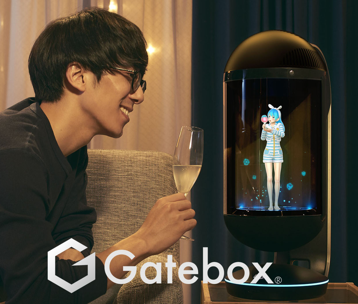
To say it is Azuma Hikari, the 'virtual home robot' of the japanese product "Gatebox".
(as Business Insider states
is Fabio Vitali, the message, therefore, is "Welcome back, Mr. Fabio. I have selected for you the latest news".
To say it is Azuma Hikari, the 'virtual home robot' of the japanese product "Gatebox".
(as Business Insider states 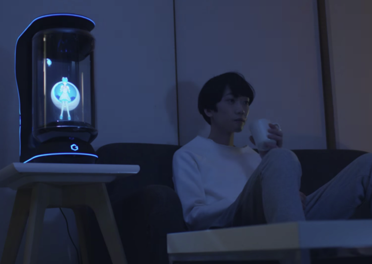 , a friend, or even a... wife ("
 the whole text is shown with the Google font
 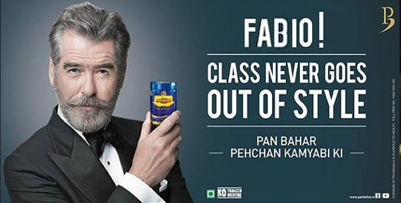 Finally, the user will notice the presence of many advertisements (11 in total, for the longest articles) during the scrolling. In fact, we believe that as time goes on advertising will become increasingly invasive and more personalized
 (want to read something interesting? Here is Eli Pariser's book "
 would like to see based on information about the user, such as location, past click-behavior ...).
Since our professor is a white italian male, with passion in IT and nerdy things, we put advertisements that could fit this kind of user (we propose three examples here,
one for tobacco, one for books and one for Netflix).
would like to see based on information about the user, such as location, past click-behavior ...).
Since our professor is a white italian male, with passion in IT and nerdy things, we put advertisements that could fit this kind of user (we propose three examples here,
one for tobacco, one for books and one for Netflix).